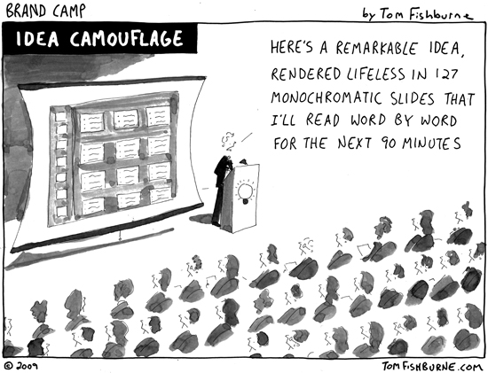
When PowerPoint came on the scene on May 22, 1990, people were genuinely excited. A disruptive technology of its day, PowerPoint promised to make presenting information cool, cutting edge, and sexy.
And in all fairness, it did just that.
For a little while.
But like any hot new thing, PowerPoint became a victim of its own success. Nearly 25 years later, it (and variations of it such as Apple’s Keynote and Google’s Presentation) continues to be the go-to framework for organizing ideas for the purpose of presenting information.
And with good reason. Presentation software is pretty darn cool when you really think about what it allows us to do.
What’s become a problem is how technology is used. Or, in the case of PowerPoint, how it’s become overused.
Is there anyone in the first world who hasn’t been a victim of “death by PowerPoint” at least once?
The thing is, PowerPoint doesn’t have to be the fall guy in our little narrative. It could easily play the supporting role to a leading actor who has to present information to an audience. It can be used to enhance the story rather than kill the story.
The secret is to create visually stunning presentations that tell a great story — and get audiences to lean in as opposed to run for the hills as fast as they can. A great plan coupled with a great design can be the antidote to the dreaded death by PowerPoint plague.
I’m hosting a free webinar that teaches just that, which you can check out here.
When you learn how to marry the power of storytelling with technology that expands possibilities, you have a winning combination. One that can even lead to hero status.
Your future audiences will thank you profusely as you swing from the chandelier and call out the collective battle-cry of professionals everywhere:
“Death to Death by PowerPoint, once and for all!”
Now that’s a story worth telling.
